The average consumer spends just a few seconds in front of a retail shelf. The concept introduced by Procter & Gamble in 2005 as the First Moment of Truth (FMOT) describes a critical window of approximately three to five seconds. During this time, a product must stand out among dozens of competitors and convince the human eye to stop and take notice. In this brief moment, packaging must achieve what other marketing channels spend months building: attract attention, persuade and ultimately sell.
What does the data say? It only confirms the theory:
- As many as 72% of consumers admit that packaging design directly influences their purchasing decisions.
- Up to 64% of customers will try a new product simply because its packaging caught their attention on the shelf.
- The “Seen = Sold” principle: retail research shows that once a customer physically picks up a product, the likelihood of purchase increases dramatically. In some categories, such as ketchup, it can rise by more than 70%. For most people, the shelf is the first physical point of contact with a brand.
Packaging is therefore not merely an attractive box wrapped around a finished product. It is an effective marketing channel capable of reaching customers at the exact moment of purchase, when they are ready to spend. A common mistake companies make is treating packaging as the final stage of a project, reducing it to a graphic design brief shaped by individual preferences and egos.
What is the cost of underestimating packaging? Enormous.
Can we quantify it? Not entirely reliably. However, the data clearly shows that only 10% of packaging redesigns actually increase sales, while as many as 20% lead to a decline. The problem is not simply the quality of the design. It is often a failure to respect how the human eye and brain actually process packaging.
The solution lies in understanding and applying the three-layer theory.
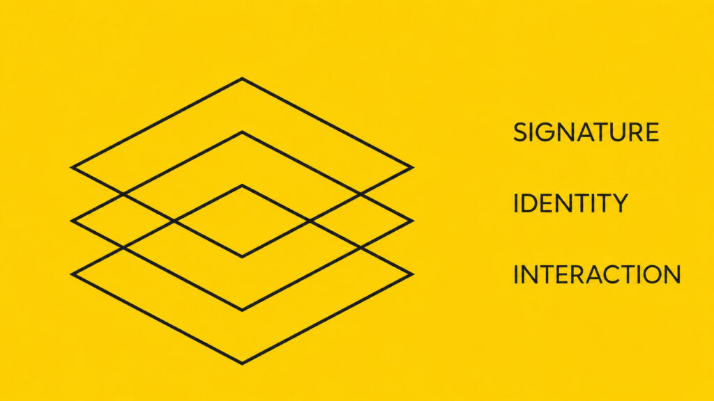
How the Brain Processes Packaging
Customers do not read packaging like a newspaper article. Their eyes do not follow a conventional, linear path from top to bottom. Instead, they scan packaging in three stages, directly related to their distance from the shelf and the way the brain processes visual stimuli.
Each layer has a different objective. If the first one fails, the customer will never reach the others.
1. Signature: The Goal Is to Capture Attention
Distance: 3 to 5 metres
Retail customers are constantly moving. Some shop systematically, while others browse more chaotically. In both cases, however, the human brain does not perceive text, logos or small packaging details from a distance of three to five metres. It processes only three elements:
- the dominant colour
- the silhouette or shape
- the overall contrast with the surrounding products
When scanning a shelf, the human eye makes rapid, jerky movements known as saccades. Our gaze does not stop on what is simply “attractive”. It stops when it detects an anomaly. The brain automatically notices when something disrupts the expected visual pattern of a category.
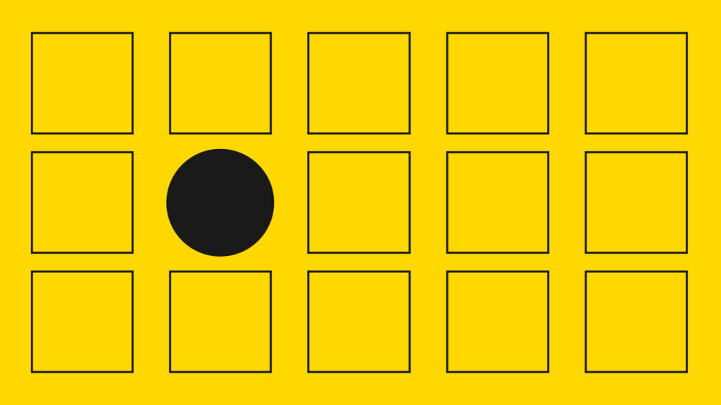
Visual attention and eye-tracking studies show that products with significantly greater colour and shape contrast compared to their surroundings achieve up to 32% longer gaze fixation and attract 27% more visual attention. (EyeSee Research / Packaging World)
The first layer therefore has one objective: to interrupt the automatic scanning of the shelf, creating a pattern interrupt that encourages the customer to take a step closer.
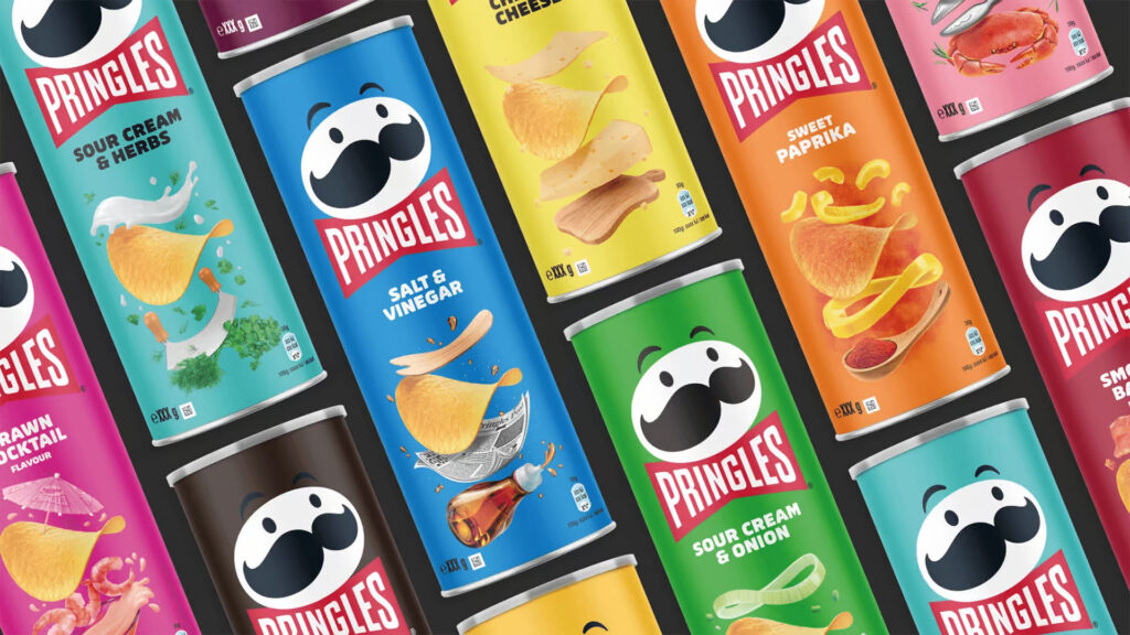
A real-world example: The savoury snack category is dominated by glossy, inflated bags displayed side by side. Pringles did not simply introduce different packaging graphics. The brand changed the silhouette itself.
Its rigid cylindrical tube stands out on the shelf regardless of the direction from which the customer approaches. This distinctive shape captures attention before the brain has time to process the logo or flavour. The same principle applies to Toblerone chocolate and the iconic Tatratea bottle.
2. Identity: The Goal Is Instant Recognition
Distance: 50 to 80 centimetres
The customer has noticed the anomaly and moved closer to the shelf. At this point, the eye shifts from the overall impression to specific details. The second layer must immediately answer two questions: Which brand is this? Which specific product or variant is it?
If consumers need more than 1.5 seconds to determine what the product actually is, cognitive overload begins to set in. They are then likely to move on to a competitor whose packaging is easier to understand.
This is where a consistent visual system becomes essential. A recognisable and properly established colour code, typography and layout must work consistently across the portfolio. Customers should be able to distinguish a shower gel from a shampoo or a vanilla flavour from a strawberry one almost instantly.
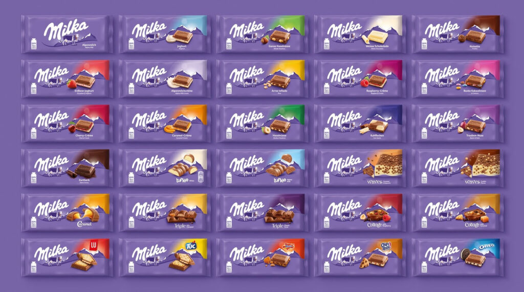
A real-world example: Milka has refined its identity to near perfection. The purple background provides immediate brand recognition. However, the true strength of the second layer becomes apparent in the way the brand helps customers navigate its portfolio.
Each flavour has a clearly defined colour accent and a photorealistic image of the key ingredient, such as green for hazelnuts, white for a milk filling and red for strawberries. From half a metre away, customers can identify the variant in a fraction of a second without having to read its name.
3. Interaction and Verification: The Goal Is Rational Confirmation
Distance: 20 to 30 centimetres
The product has successfully passed through the first two filters, and the customer is finally holding it. This is when the rational layer of packaging comes into play. The customer reads the ingredients, nutritional information, certifications, instructions, brand story and smaller details.
At this stage, the initial emotional impulse is either supported by rational confirmation or replaced by doubt, causing the customer to return the product to the shelf. While the first two layers engage the subconscious and emotions, corresponding to Daniel Kahneman’s System 1, the third layer communicates with analytical thinking, or System 2.
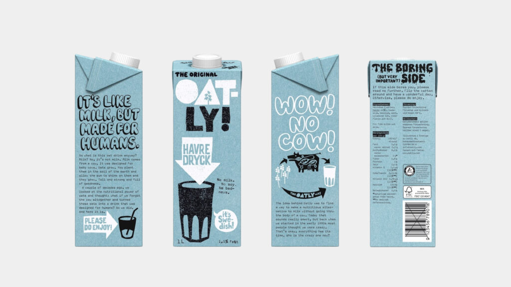
A real-world example: Swedish plant-based milk brand Oatly has turned the third layer of its packaging into one of its greatest strengths.
When customers pick up a carton, instead of encountering only sterile nutritional tables and mandatory information, they find long, witty passages written in Oatly’s distinctive sarcastic tone of voice. Together with prominently displayed carbon footprint information, this creates a strong sense of transparency and connection with the brand’s environmental values, helping to overcome any remaining hesitation at the point of purchase.
Visual Clutter: The Most Common Packaging Design Trap
The most frequent mistake in packaging design is trying to fit everything into one place. Manufacturers want the front of the pack to feature the logo, three different benefits, an environmental certification, a slogan and an illustration, all with the same visual priority. The result is visual clutter. The brain is confronted with too many stimuli at once, interprets them as chaos, and the customer either ignores the packaging completely or reaches for a competitor whose message is easier to understand.
Effective packaging respects viewing distance and the different stages of the purchasing process. The signature stops the customer from a distance. The identity explains what the product is at closer range. The interaction layer provides the final reassurance once the product is in the customer’s hands. If just one link in this chain fails, the others lose their purpose. The customer will simply never reach them.


