HYZAChicken from a Good Address
Division
Consumer Goods & Retail
Services
Brand Strategy, Brand Identity, Packaging, Audit & Analysis, Web Design & Development, Photo & Video Production, Social Media
The HYZA brand asked us to develop its values, formally revise its mission and vision, redesign the packaging of its product portfolio, and manage its long-term communication on social media.
HYZA is a leader in the poultry and poultry products market, operating in Slovakia for over 70 years and employing approximately 900 people. Since 2006, it has been a member of Agrofert holding, which unites over 230 companies. HYZA is a multiple award-winner of Slovak Superbrands as well as the Global Food Safety Initiative. In production, it adheres to Animal Welfare principles and maintains transparency throughout the manufacturing process.
At the outset of the project, we conducted several interactive workshops with management and representatives from all key areas of HYZA. Through extensive brainstorming sessions, we enabled employees to express themselves, share their insights with colleagues, and identify common threads. These insights, combined with the results of a consumer survey, became indispensable for our further work with the brand, allowing us to define its core values and refine its mission, vision, purpose, and communication tone.
We summarized the defined brand attributes, target audience definition, product portfolio analysis, and other outputs in a unified document—the brandbook. This document serves as a compass, guiding the brand and those responsible for its management in making crucial decisions about its direction. HYZA recognizes the importance of maintaining a consistent packaging design and its long-term shelf appeal, which is why they asked us to develop a new design language capable of covering the brand’s needs over the long term and quickly responding to changes.
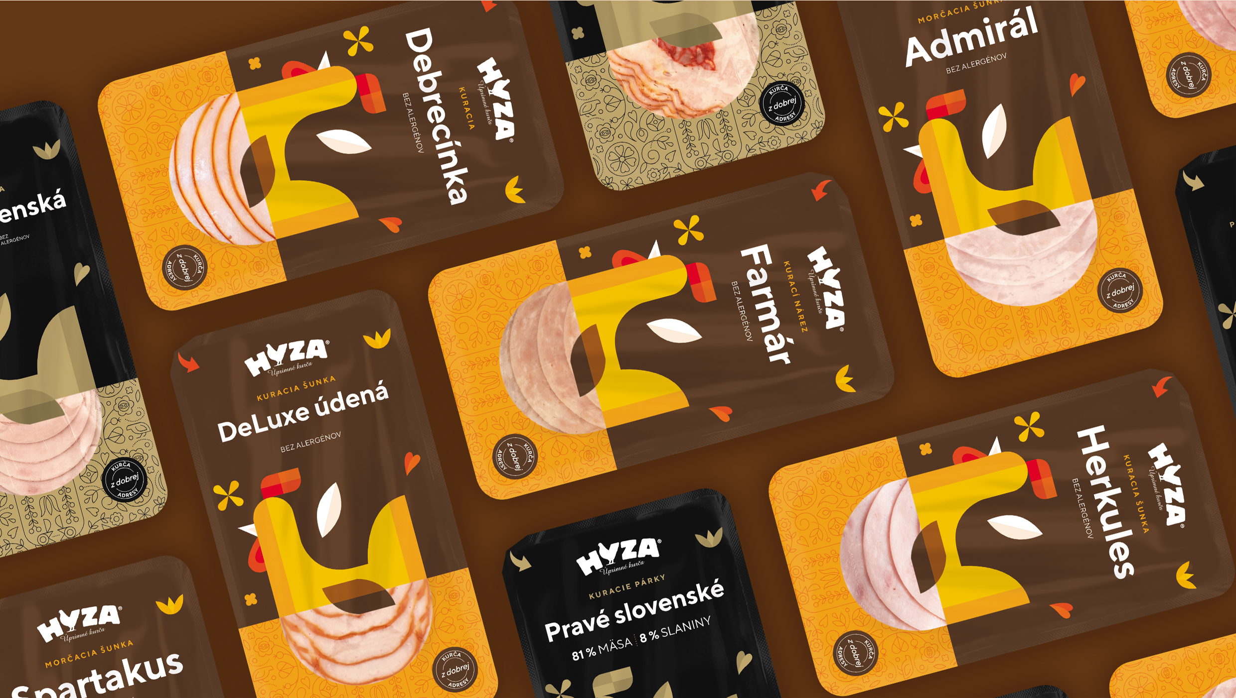
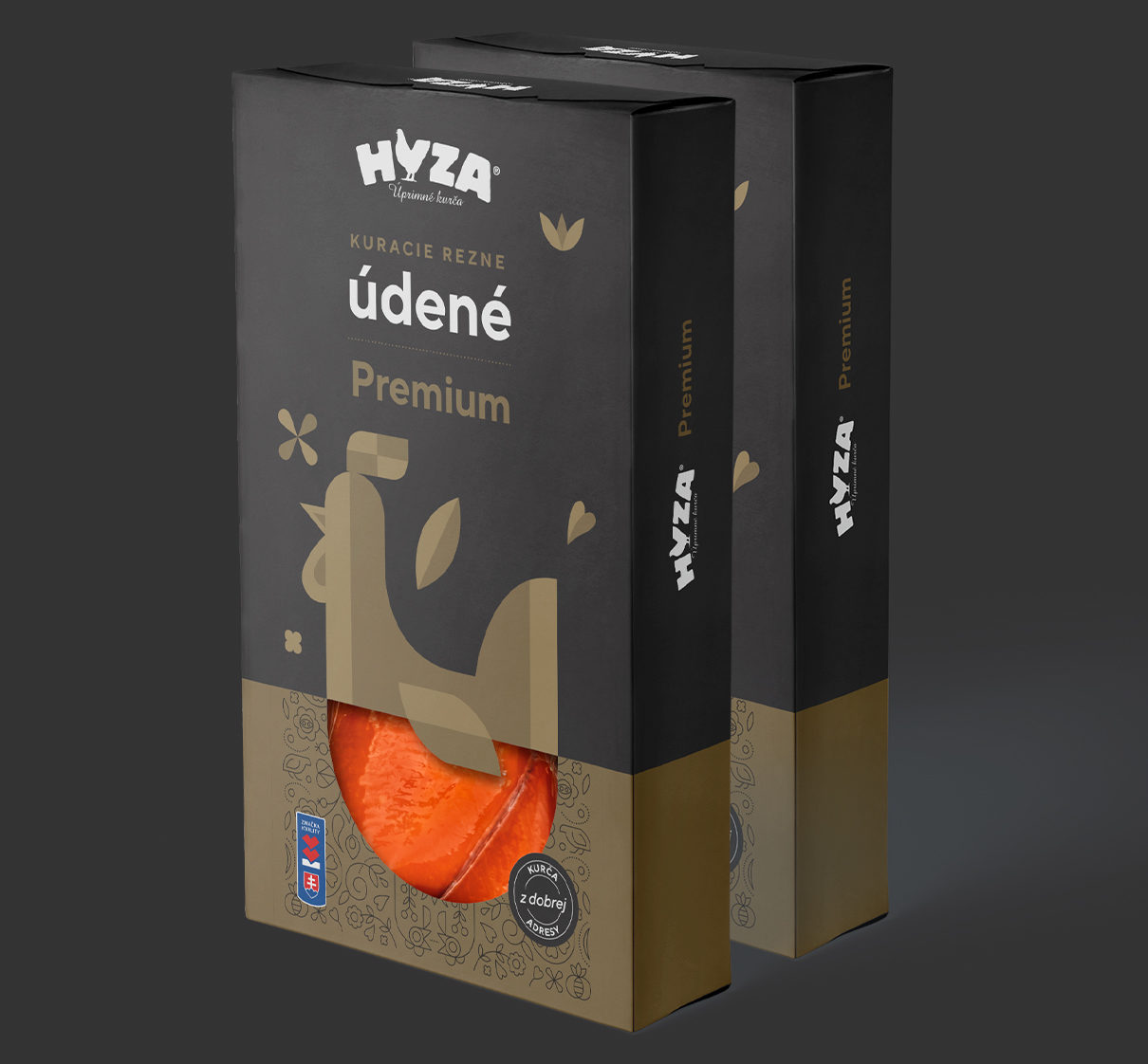
Before fully diving into the creation of the new design system, we conducted a thorough analysis of various types of packaging, weights, flavors, and sizes of the current products. A key part of this process was a workshop with the brand’s stakeholders, during which we collaboratively designed the architecture of the product lines, defined both unifying and differentiating design elements, and verified the feasibility of our proposals. We based our work on the tradition that HYZA represents, while also incorporating a modern approach evident in both production and market behavior. Our goal was to unite these two seemingly contradictory ideas.
The central motif of the new packaging design became a geometric symbol of a chicken. Derived from a folk pattern created for the brand’s 70th anniversary, this symbol is complemented on the packaging by a transparent window that showcases the product, along with other elements of the traditional pattern. By combining these new elements, we succeeded in creating a unique and versatile design that is immediately distinguishable from the competition. We also proposed logical changes in the creation and application of nomenclature, enabling the brand to flexibly expand or narrow its portfolio while maintaining long-term visual consistency.
We extended the new packaging design to product photography on the website as well as to a variety of promotional materials, product catalogs, and in-store flyers. The brand refresh is also communicated on social media. Regular original content, managed by our in-house production team and experienced social media specialists, consistently achieves high engagement and positive feedback from fans. We employ series-based content, communicate contests, traditional Slovak recipes, and even specific tastes from abroad. Fans are inspired by traditional folk costumes, dialect words, amusing riddles, and content produced in collaboration with influencers.