SCROLL DOWN
MATADOR GroupInnovation to Win
Industry
Mobility & Hospitality
Services
Brand Identity, Web Design & Development, Sound branding
Iconic Brand MATADOR Asked Us to Redesign Its Visual Identity, Create a New Sound Logo, and Oversee All Communication Activities.
The MATADOR brand has over 115 years of history in Slovakia. In 1950, it became one of Central Europe’s largest and most innovative tire manufacturers. After selling off its rubber division, the company began transforming into a top-tier TIER 1 supplier. With the acquisition of AUFEER DESIGN from Mladá Boleslav, the brand expanded into design and development.
Today, MATADOR Group is a successful automotive supplier operating in three European countries, with a clear ambition to help shape the future of global mobility.
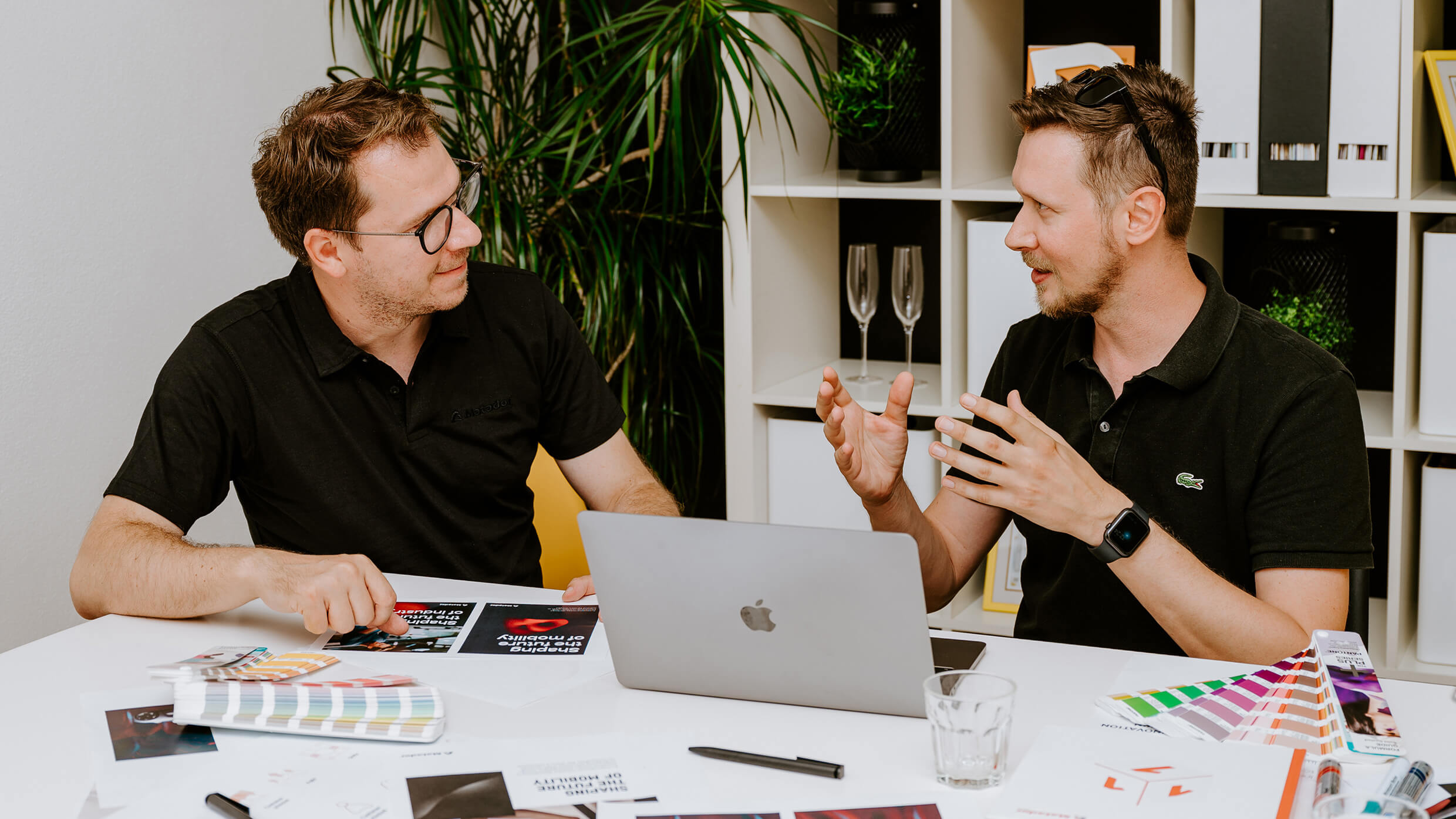
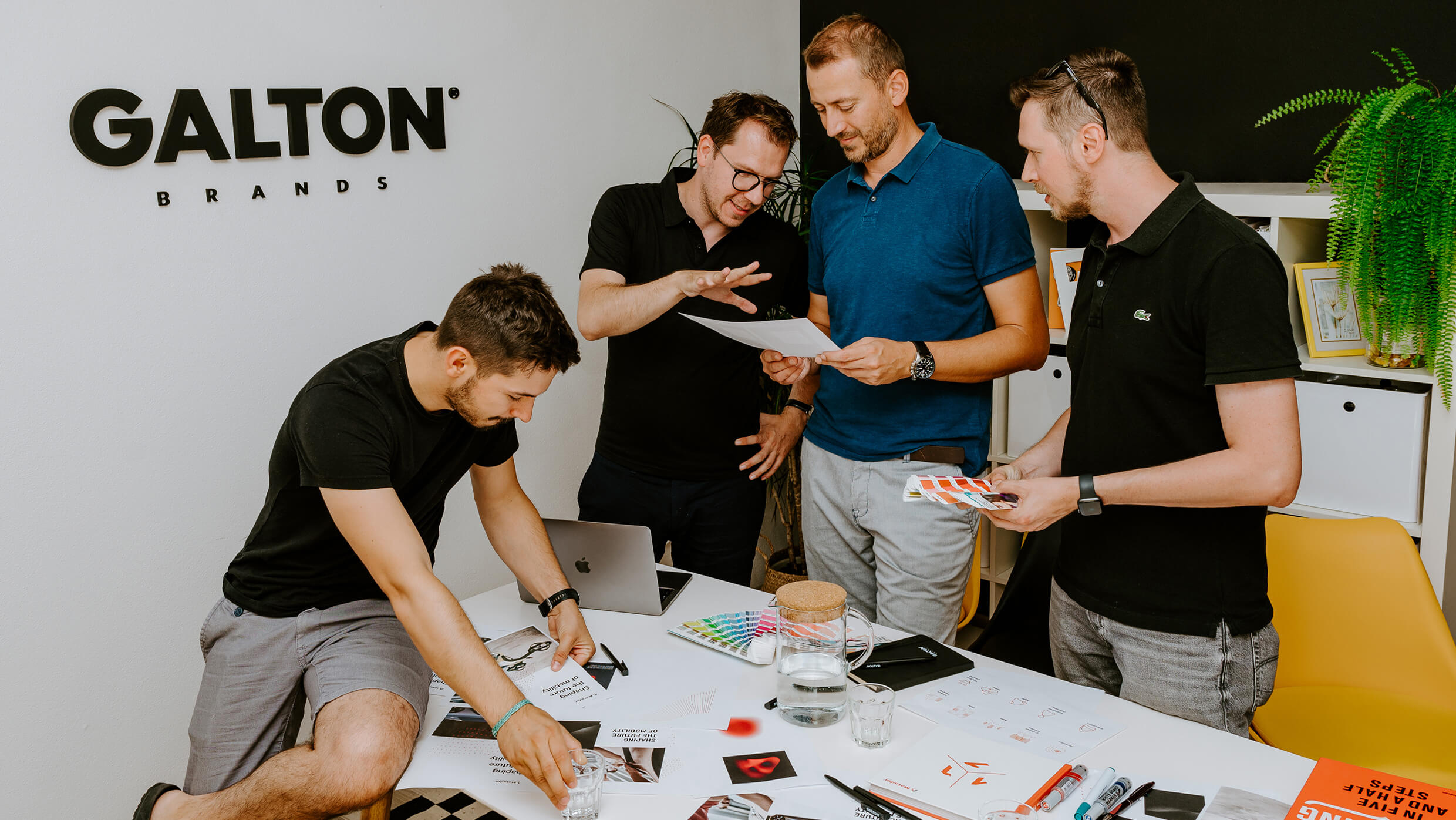
Interactive Workshop
Our collaboration began with a series of interactive workshops alongside MATADOR Group’s brand manager. We explored the brand’s heritage, current activities, and long-term ambitions.
Together, we dissected the new communication strategy, early visual drafts, and the brand’s value system. This process helped us clarify the creative brief and propose a solution that met the expectations of both internal stakeholders and the brand’s target audience.
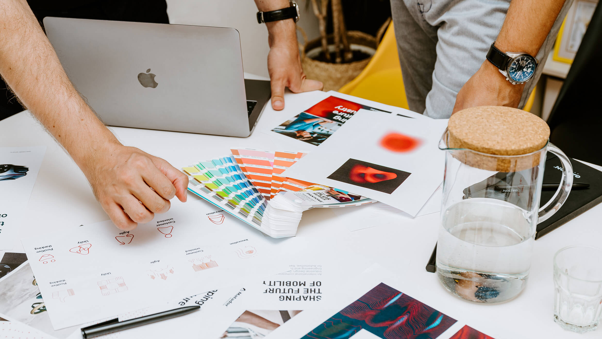
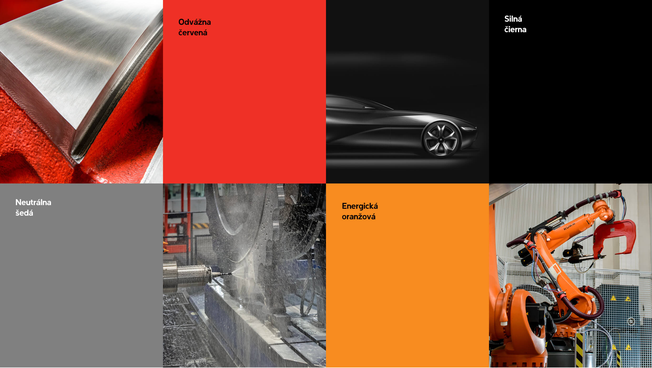
A Well-Known Color Palette,
A Whole New Typeface
For 115 years, MATADOR Group has remained faithful to its signature red, black, and white palette—symbols of energy and dominance. And during the latest redesign, management saw no need for a dramatic shift.
We chose to enhance the palette with a subtle addition: a vibrant orange and a neutral gray. These accents add design flexibility without compromising the brand’s bold character.
Typography, however, saw a far more significant evolution. We introduced a modern, clean typeface that performs beautifully across both online and offline brand touchpoints.
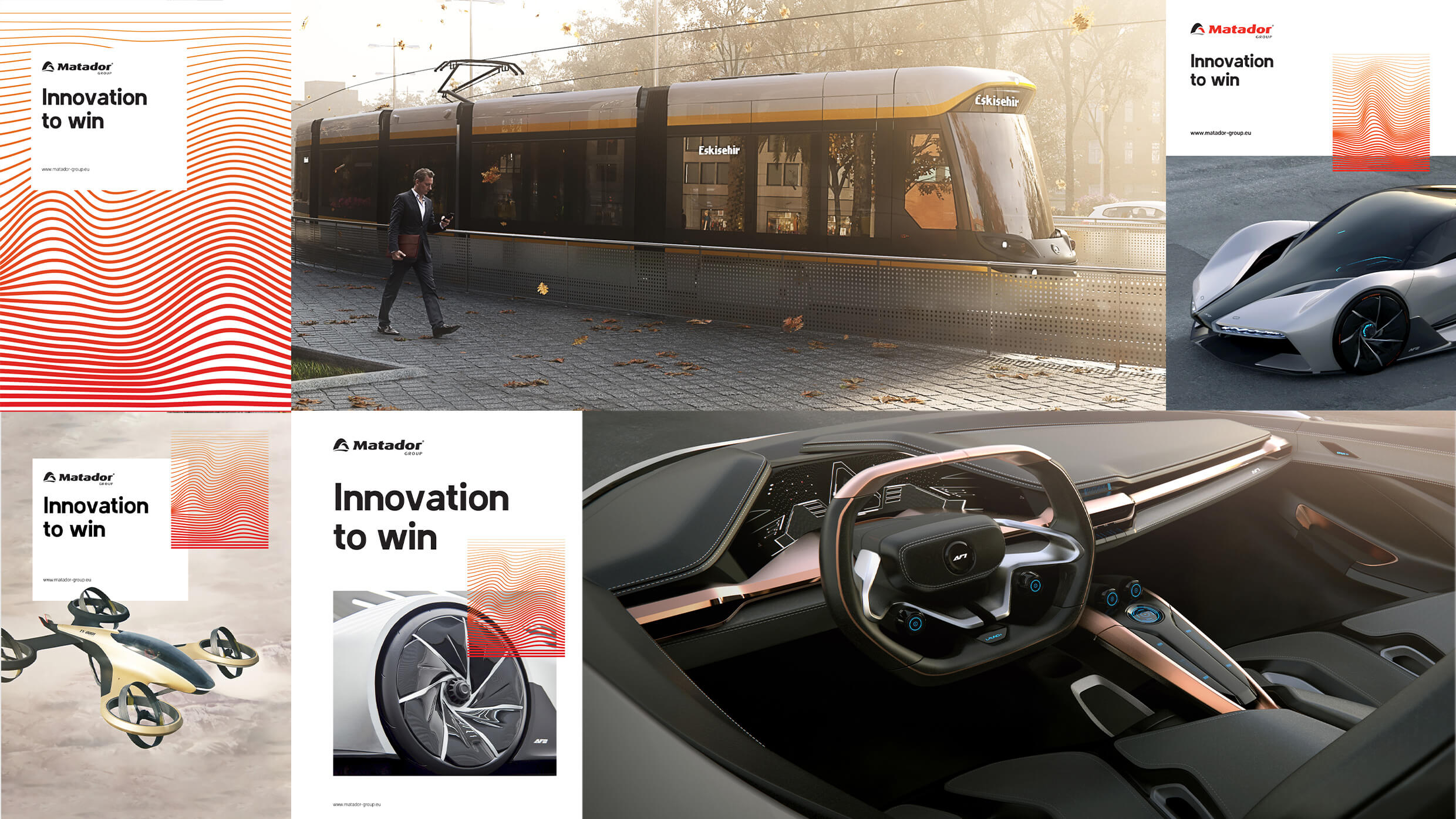
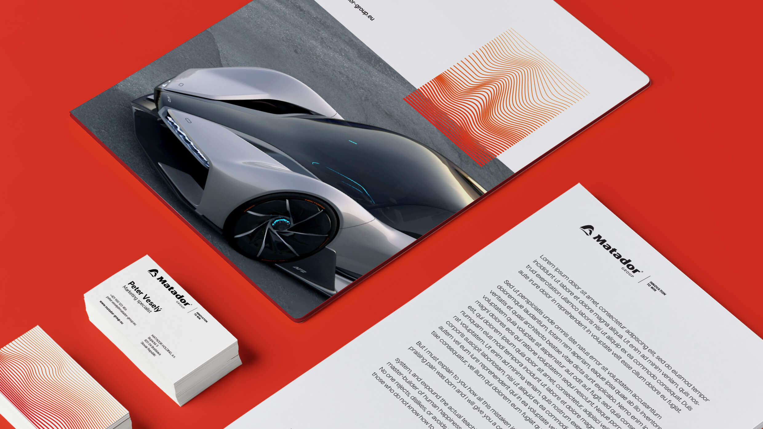
A Bold Brand Identity
Driven by Movement
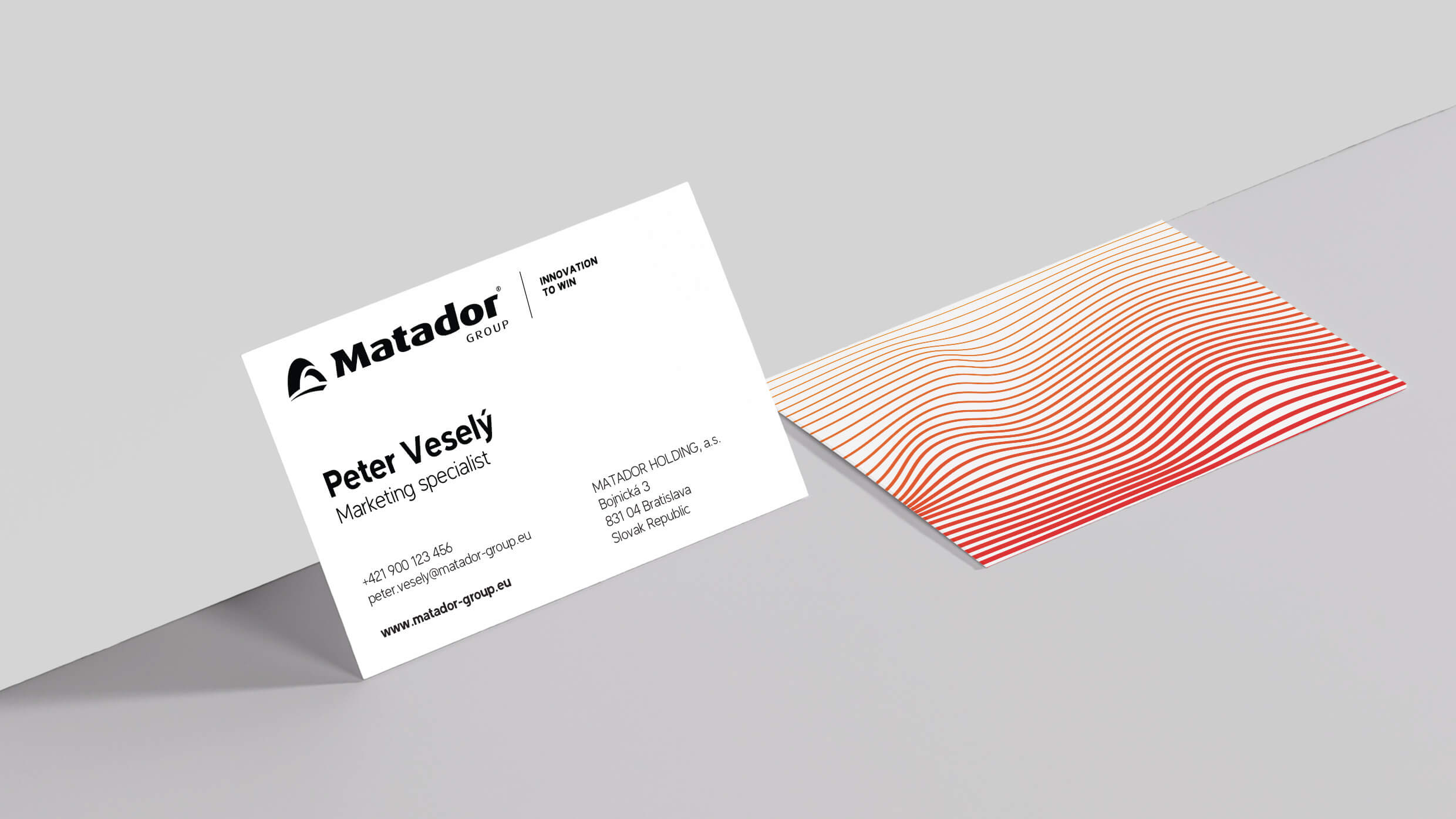
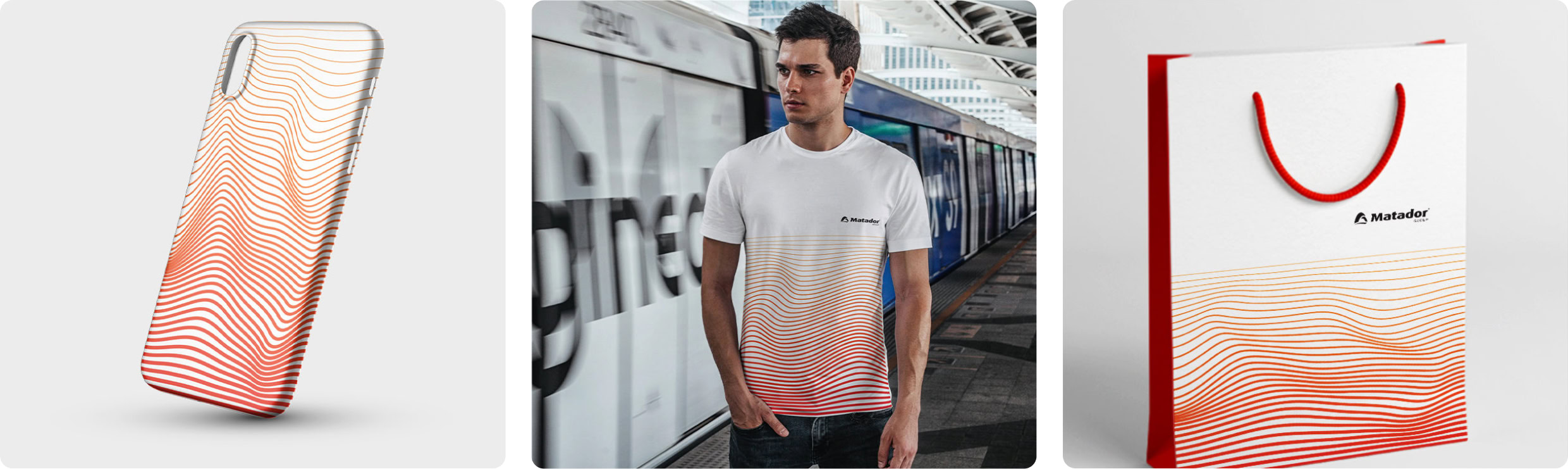
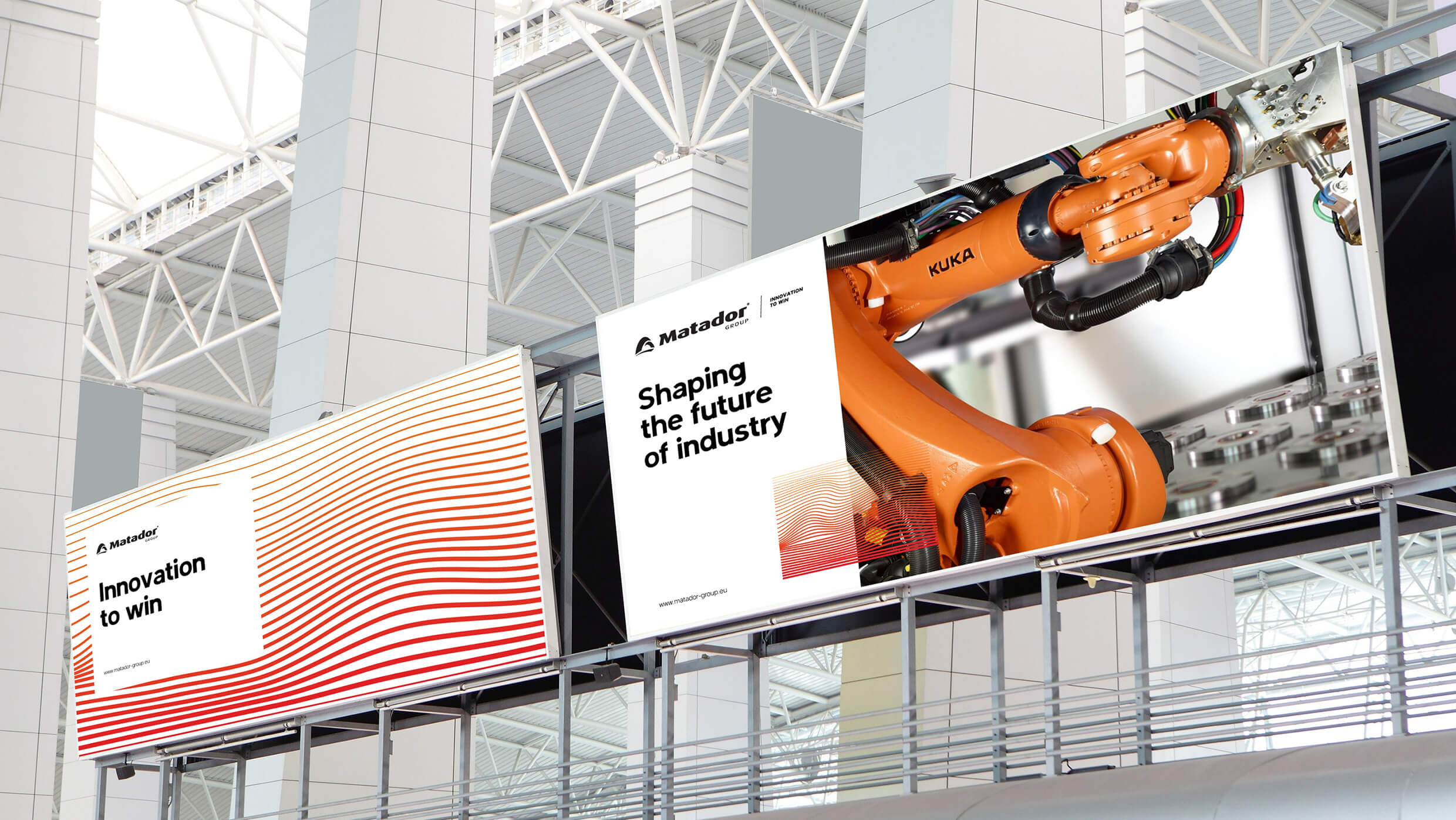
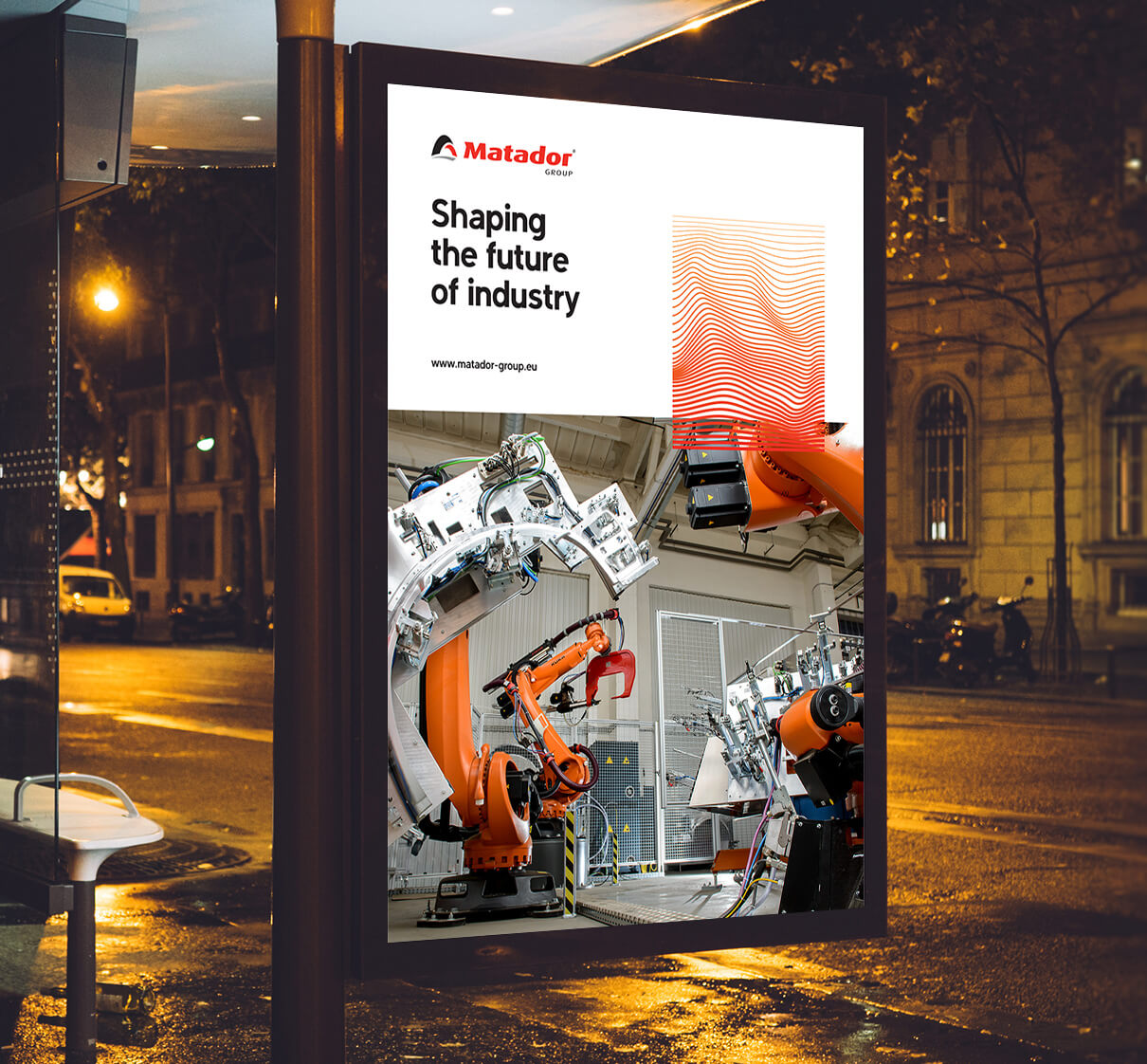
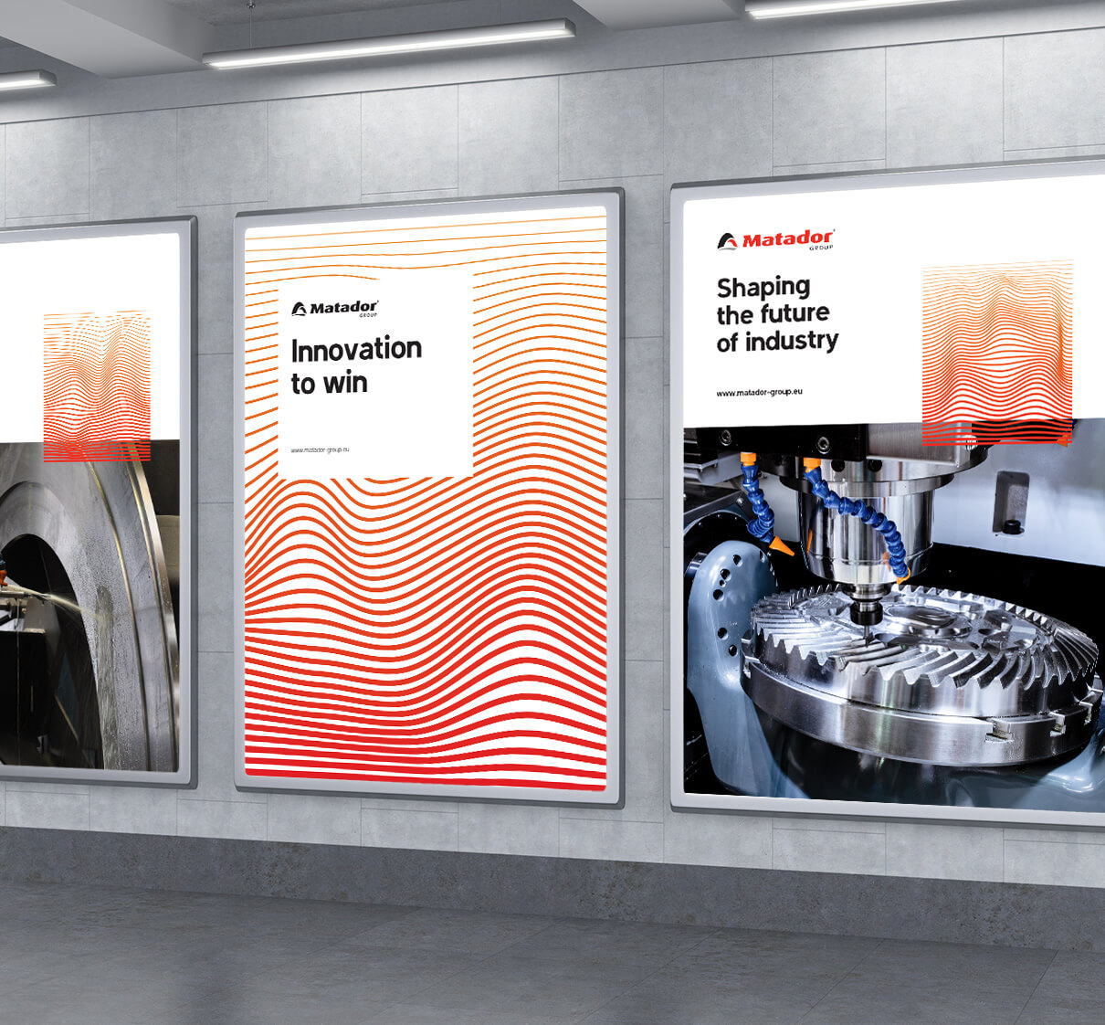
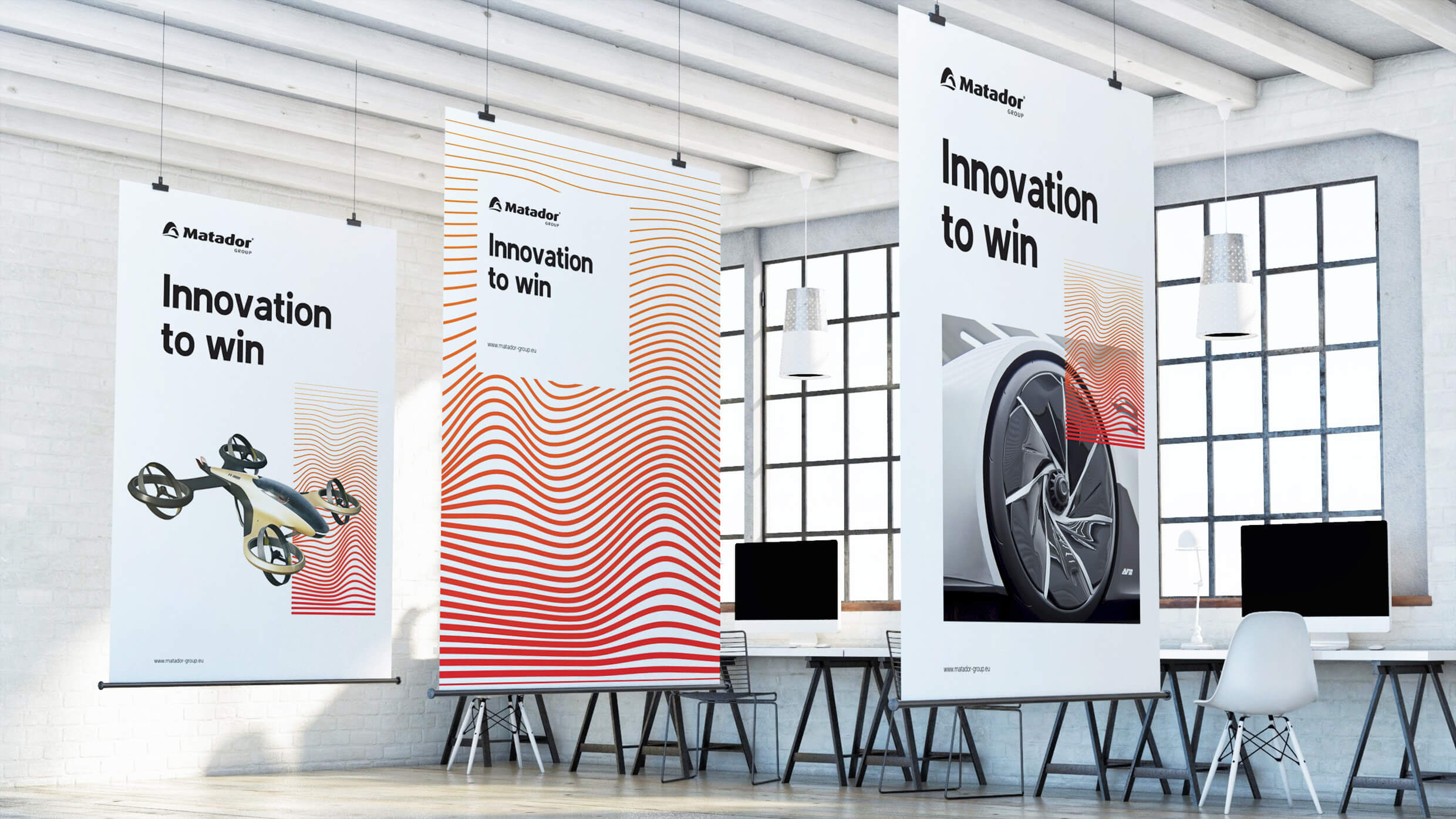
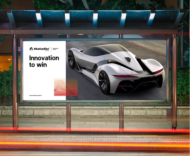
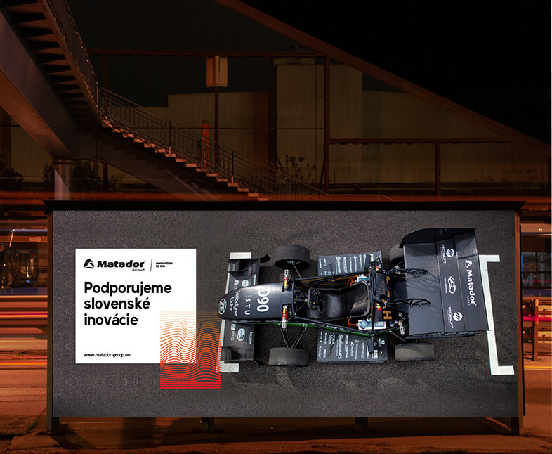
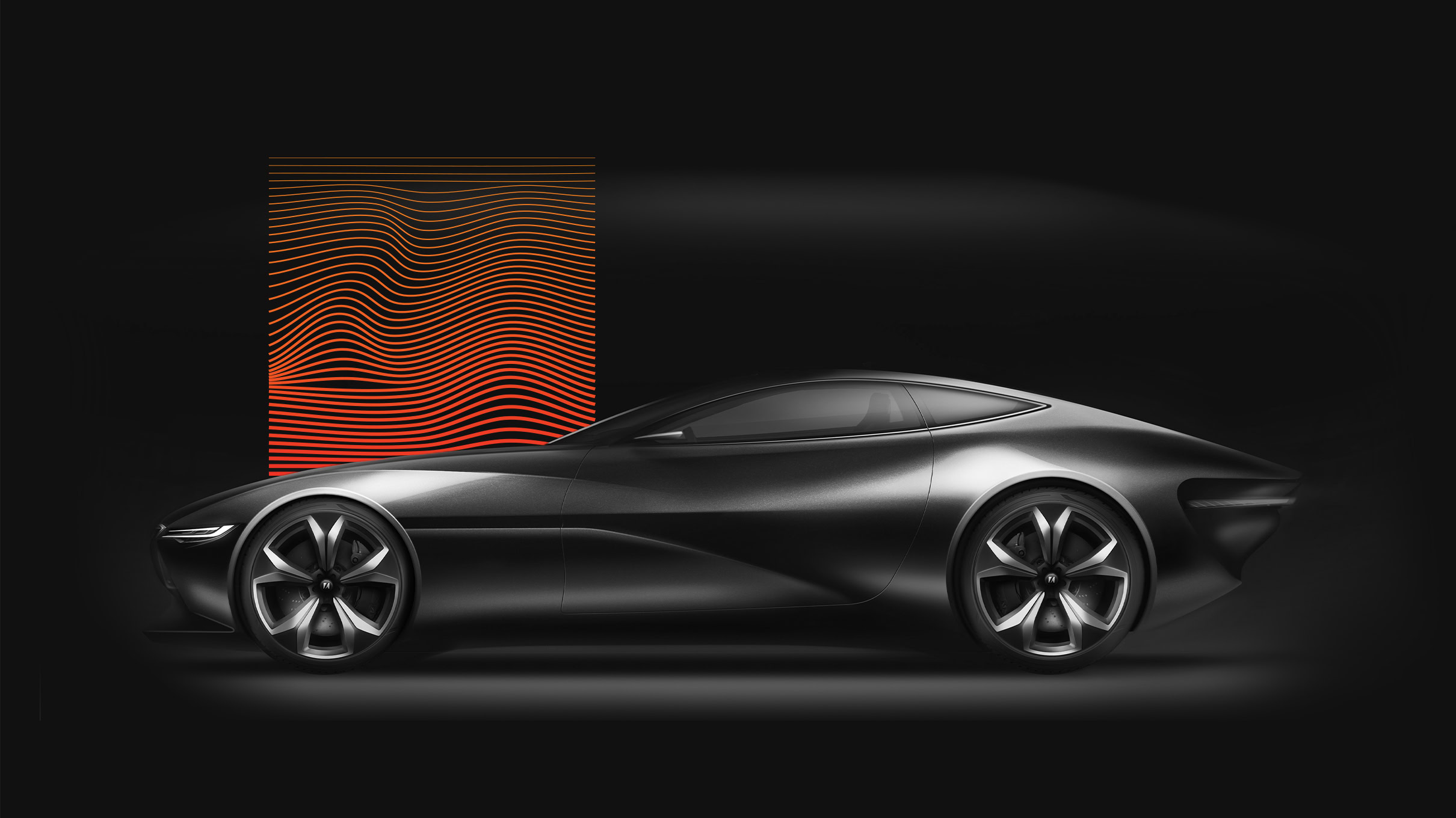
The centerpiece of the new visual identity is a series of bold, wave-like visualizations in deep red and orange hues. These waves symbolize vibrations—transmitting energy or information from one place to another.
Much like MATADOR Group itself, these waves reflect constant movement—from generation to generation, technology to technology, and industry to industry.
This wave becomes a visual metaphor: powerful, scalable, and memorable. Whether applied full-screen or in isolated detail, it boosts recognition and recall for the MATADOR brand.
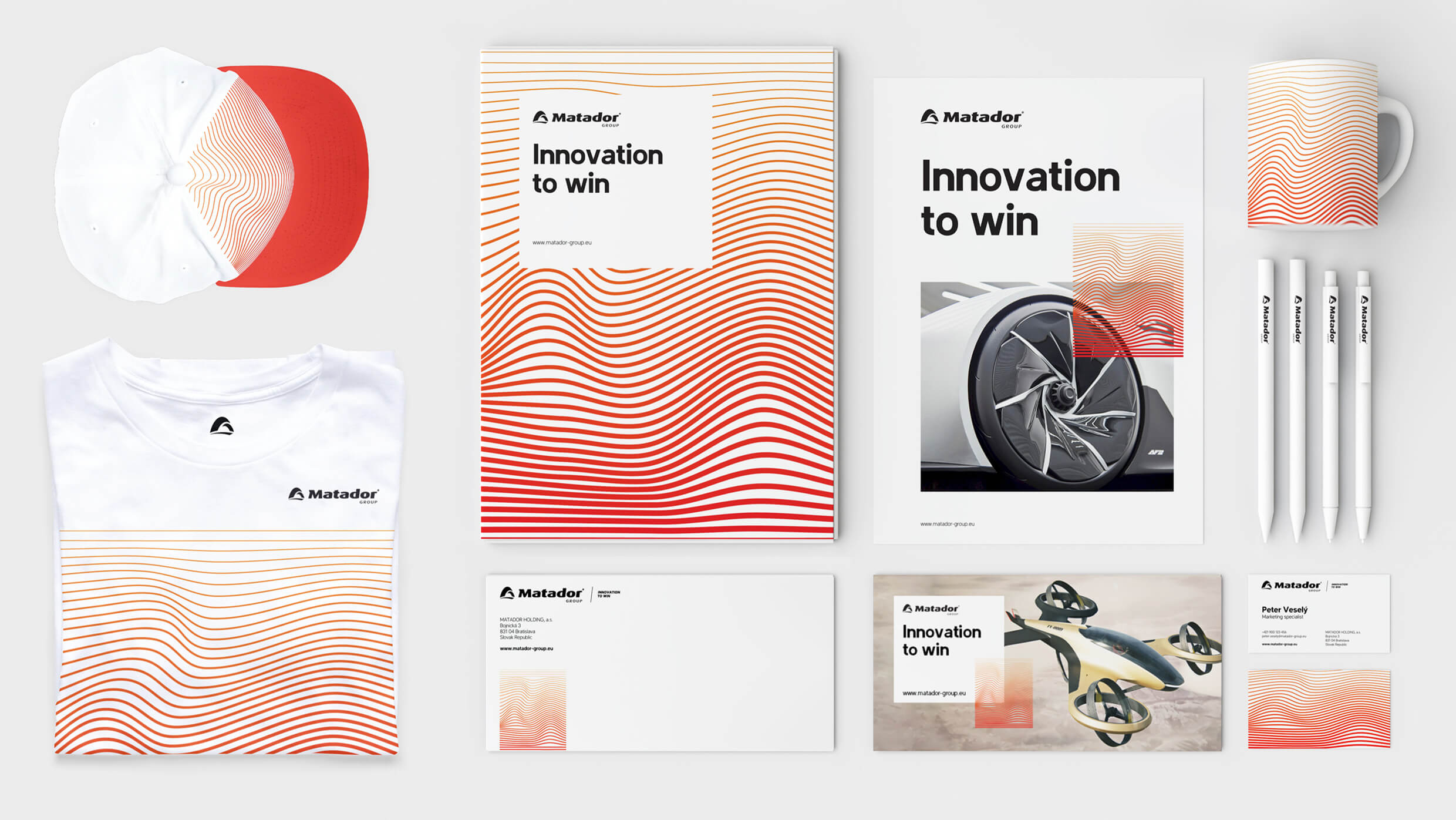
A Striking Identity
and Stylish Merch
With hundreds of employees and a presence in three European markets, MATADOR Group operates across a diverse range of business areas—from design and engineering to serial production and industrial automation.
We created a flexible identity system that reflects that scale—branding everything from envelopes and business cards to mugs, t-shirts, and other merchandise that bring the brand to life internally and externally.
Evolving the Brand’s Visual Language
The design language we introduced marks a clear evolution in MATADOR’s brand identity. Paired with the new communication claim, “Innovation to Win,” the refreshed look aims to position MATADOR as an innovation leader in its segment.
It’s a bold, deliberate step into the digital age—giving the brand confidence to embrace more progressive communication strategies.
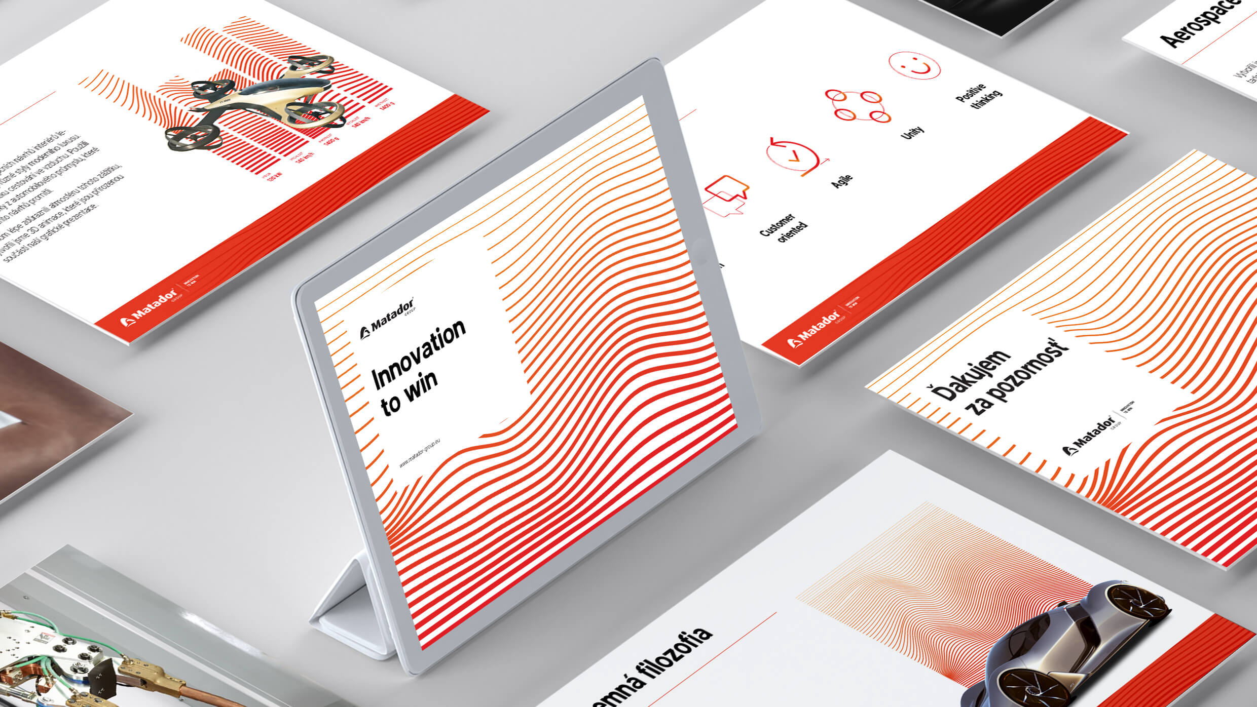
The new corporate identity is documented in a detailed brand and logo manual to ensure visual and strategic consistency across all channels.
Design Language for a Digital World
To expand the brand’s digital potential, we included dynamic, modern visual elements.
Stylized wave animations and product visualizations opened up nearly limitless creative applications—not only for social media but for a wide range of digital platforms where the brand needs to shine.y.
A Modern, Memorable Sound Logo
As part of its commitment to innovation, MATADOR also embraced a bold new sound logo from our production team.
A deep, resonant tone—paired with a subtle electronic finish—echoes the sound of a powerful engine, paying homage to the brand’s automotive legacy.
This sonic identity will be gradually rolled out across all multimedia formats, becoming a key part of the brand’s distinctive communication toolkit.