A fair-affiliate network
Dognet asked us to redesign their brand strategy, give their logo a facelift and create a new, attractive visual as well as audio identity.
Dognet is an affiliate network that has been around for more than 9 years. The multi-national company operates in 12 countries and provides a comprehensive affiliate marketing solution for hundreds of clients. In collaboration with 5000 bloggers, influencers and content creators, Dognet brought its advertisers turnover exceeding 242 million €.
Defining key brand attributes
Dognet was founded with the intention of building their services on quality, communication, professionalism and added value. Today, after years of successful activity on the European market, the management began to feel the need to change and refresh their communication.
We started our cooperation with an in-depth audit of the current state of the brand. Together with the key representatives of Dognet, we discussed the background of the company’s establishment, the values that influence its daily life, but also the vision of its future direction. We used the obtained information for the creation of a new visual language of the brand. Our goal was also to formally anchor the attributes of the refreshed brand in a manual, in order to ensure its consistent development in the future.


Logo refresh
After defining the character of the Dognet brand and identifying the starting points for creating a new identity, we proceeded to refresh the logo. By making subtle modifications to the original pictogram and colors, and by completely changing the typography, we achieved a more modern look of the logo, resulting in a broader and simpler usability across online and offline environments.
Vivid colors, minimal typography
The Dognet color scheme and typography underwent significant changes as well. We widened the original palette of turquoise shades by a striking tint of orange, which revived and energized the brand’s visuals, giving them an optimistic feel. The typographic style is built on the modern Gilroy sans-serif font with clean geometric lines, which offers sufficient character variability for use in all markets where the brand operates.
Custom-made icons
The design of the brand’s new visual identity also includes a stylish icon set. Its purpose is to make the presented information more attractive to the viewer and enable the recipient to quickly understand the context or content of the communication. The designed icon style respects other visual elements, using geometric shapes and bold rounded lines.
Pattern as an important element of visuality
One of the principal components that define the brand’s new visual language is seen in distinctive geometric patterns, representing a network of advertisers and publishers. Their interconnection forms the essence of the Dognet brand. The varied color combinations and pattern sizes allow for a wide range of possibilities and variations of use in different contexts of communication.

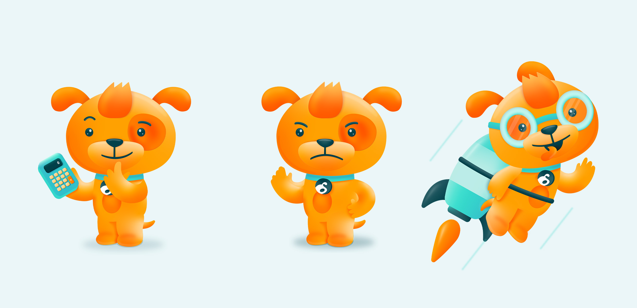
Brand’s character, incarnated
Probably the most significant change in Dognet’s approach to communication is the personification of its character in the form of a mascot. The unique and easily memorable character of a dog ties strongly to the friendly personality traits of the brand, as well as its tone of voice and visuality, giving it an unforeseen emotional touch. The mascot’s extensive range of shapes and expressions facilitate the memorability of the brand, while being able to swiftly adapt to the context of its use based on the target group and the communication channels.


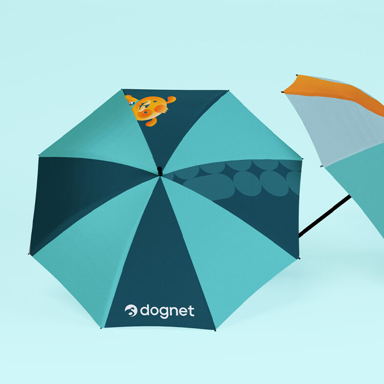
Consistent identity for years to come
Striking colors, variable yet original patterns and modern typography are present in all means of communication: and standard elements of correspondence such as business cards, binders or social media templates are no exception. We have summarized the appearance of standardized visual communication elements and the rules for their use in a clear manual, the task of which is to ensure consistent brand communication for years to come.


Friendly community engagement
Thanks to the already established friendly communication style that Dognet uses when talking with publishers, we were able to afford to be more daring when it came to creating visuals.
We made the texts witty and visuals playful, which positioned the brand as friendly, open and rather cheeky, which was exactly what we aimed for – since traits like these are positively seen in the content creation community.


The proposed design language represents a significant change in the brand’s visuality and together with the communication claim “No more tales, let’s grow sales” it is fulfilling the brand’s ambitions to be a fair affiliate network with a local focus and a human approach. This change aims to make the brand better suited for the constantly evolving digital environment of today.


