We protect health and the environment
STEBERG asked us to propose a new strategy for the company, including brand architecture, logo design, visual identity and an attractive website.
STEBERG is a stable supplier of goods and services for the private and public sector, as well as EU projects. During their 35+ years on the market, the company has been developing business activities in 20 countries and in five divisions - covering the area of fabric supply , work clothes, waste management, as well as the defense and rescue segment.
A natural step towards a redesign
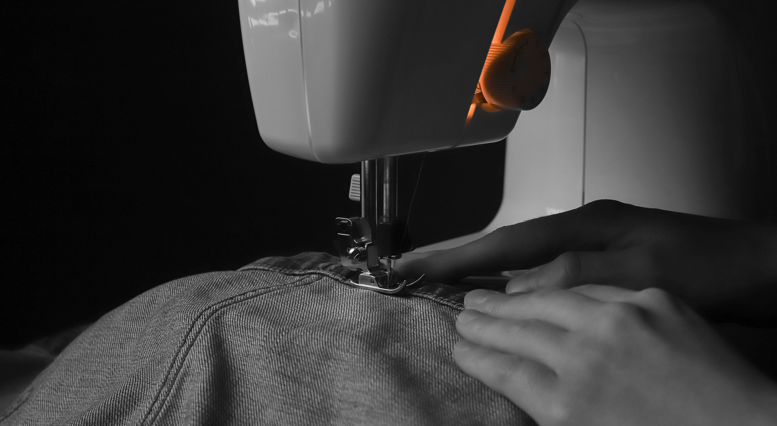
Being a family company based in Slovakia, STEBERG initially started out as a manufacturing company specializing in denim textiles. After years of operating in the manufacturing segment, the company has managed to exploit new business opportunities in the Asian markets. The brand gradually expanded to other segments and became an international business partner in the supply of various products for commercial entities and public administration. However, the expansion of the portfolio resulted in the increasingly fragmented presentation of the brand. The different communication patterns, logos, colors and typography across divisions were leaving the clients little confused. This led the management to the decision to redesign and unify the brand’s communication style.
Unifying strategy
and communication style
We kicked off our collaboration with an in-depth audit of the current state of the brand, its communication and visual identity. Together with the client, we redefined the vision, mission and purpose – and we proposed to set crucial values for the consistent development of the brand. In addition, we have identified a clear brand personality and its tone of voice. We also revisited Steberg’s brand positioning, and with a new, more integrated brand architecture, we set the stage for a frictionless future expansion of the brand portfolio.


Attractive logo
built on history
The new brand logo is built on the history of STEBERG. By specifically aligning the two parts of the name – STE and BERG – we have created a geometric element that represents the tailor’s stitch typical for denim products. Concurrently, the logo expresses equality between business partners through the universal symbol (=). The logotypes belonging to different divisions are extended by specific names and are color coded in the middle line of the letter E.
Neutral colors,
attractive typography
The neutral black-and-white colors of the STEBERG brand are complemented by refreshing splashes of color, proper to each individual division. This clear color-coding is supplemented by a division-specific logo and a photograph, which emphasizes its visual context. In this way, it is possible to expand the brand portfolio practically without any restrictions.
The typographic style is created by modern sans-serif fonts, since they offer sufficient variability of characters across all markets where the brand operates.

Modern dynamic elements
The visual personality of the brand embraces modern gradient elements, symbolizing agile mindset and the ability to quickly adapt to the market needs. The graphic elements are based on the horizontal line of the logo and in each division they embody a different shape and color. This visuality is complemented by enticing photos and tailor-made icons that complete the overall look of the brand and give it a distinctive character.
Visual identity package,
extended
As part of the visual identity, we also developed an extensive design manual for the client. It contains graphic templates for social networks, digital presentations and merchandise, in addition to the standard elements of correspondence, business cards and binders.


Uniform visual system
The brand’s new visual style was also reflected in the series of product and image visuals. We have prepared them with an emphasis on the variability and clear individuality of each business division. They can be used in both the offline, as well as online communication.


Consolidated design, reliable
technological solution
One of the key elements of communication and the new visuality of the STEBERG brand is a modern website built on advanced interaction elements, smooth animations and distinctive typography. The central theme acts as a connector between the various divisions, each acting as an individual part of one whole organization. The sophisticated system architecture, in turn, impresses with its wide range of scalability according to the client’s future needs.


