SNAP - Shaping your tomorrow
The company SNAP International asked us to comprehensively define the brand in the context of the market and competition and design a new, attractive visual.
SNAP International is an ambitious company that has been working on the integration, management, and implementation of SAP projects for companies around the world for almost five years. SNAP consists of a team of enthusiastic consultants and developers who daily design solutions for streamlining, simplifying, and digitizing the management of companies in various areas of business.
Workshop with stakeholders and employees
SNAP International advises and helps their clients to better manage their business thanks to intelligent technologies. At one point, however, brand owners realized that in their business there are times when the help and perspective of an impartial expert are needed. As experienced consultants, they knew that it would be impossible without the necessary information. Therefore, they readily attended several interactive workshops with us, where we had the opportunity to discuss openly with all team members, gain valuable insights about target groups, typical business relationships, but also internal rituals or the brand character.
Subsequently, we designed a motivating and aspiring brand mission for the client. We analyzed the competition in the segment, defined a set of values reflecting the company’s internal state and created clear communication rules. Together with the client, we specified the basic differential elements, which we later used to design the logo, visuals and website.


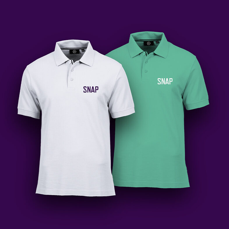
Attractive logo and identity
When designing the logo and visual identity, we built on the idea of the infinity symbol, which is formed by the negative space of the letter S. The importance of the endless loop also reflects the company’s ability to support clients in achieving unlimited goals without the need for constant change of internal company processes and systems, because the proposed solution “grows with the client”.
Energetic colors and technical typography
The color system utilizes a wide range of tones that emphasize progress, energy, elegance and optimism. The chosen color reflects a modern and bold approach, which is absent in the visuality of most tech companies, but it is essential for the SNAP brand. From the point of view of typography, we built on a simple condensed font Refrigerator Deluxe, which further intensifies the technological aspect of the brand and gives it an unequivocal look.

Custom-made icons
As part of the design of the visual identity, we have also prepared a tailor-made set of icons, the design of which copies the specific roundness of the font and utilizes a partial color overlay of the elements. They have found their versatility not only on the company’s website, but they are also a valuable visual addition to other online or offline communication touchpoints.
Modern, progressive visuals
The visuality of the SNAP brand is based on a distinctive element of infinity, which is also used in the design of the logo. With different levels of zoom and cutout, we achieved a diverse appearance in the visuals, while still maintaining a uniform design and color style. The proposed visual language thus gained sufficient variability and is easily applicable to various means of communication. We used it to design rollups, posters, business cards, letterhead and envelopes.


Consistency across platforms
Every element of the brand’s visuality thus works uniformly and consistently. In addition, the used visuality gives the SNAP brand a certain playfulness and dynamism, with which not only employees but also business partners, who have already had the opportunity to cooperate with the brand, can identify.


Reliable technology,
attractive design
The SNAP brand combines modern technologies and managerial know-how to aid companies around the world. Its communication in the online space must therefore reflect both aspects – humanity and technology at the same time. Coming from this foundation, we started to create the website as a communication channel with a dominant position. Modern design following the proposed visual identity and eye-pleasing animations that speak to the people, the tuned speed and clear structure will attract a technically oriented audience. In essence, the new SNAP website provides the perfect balance between function and design – form and content.


