Innovation to win
The iconic MATADOR brand asked us to design a new visual identity, create a sound logo and comprehensively cover its communication activities.
The Matador brand‘s history in Slovakia stretches for more than 115 years. In 1950, it became one of the largest and most innovative tire manufacturers in Central Europe, and after the sale of the rubber division, it began its transformation into a top TIER 1 supplier. Following the acquisition of the design studio AUFEER DESIGN from Mladá Boleslav, the brand has expanded its portfolio to include design and development. Today, the MATADOR Group is a successful supplier to the automotive industry, operating in three European countries with the ambition to significantly shape global mobility.
Interactive workshop
We started the cooperation with a series of interactive workshops, in which we led a discussion with the brand manager of the MATADOR Group brand about the history of the company, its current activities and ambitions for future. We discussed in detail the new communication strategy of the brand, pilot designs of visuality and its values. This approach helped us to better grasp the creative task and design a solution that not only fulfilled the demanding requirements of stakeholders but also the target audience.


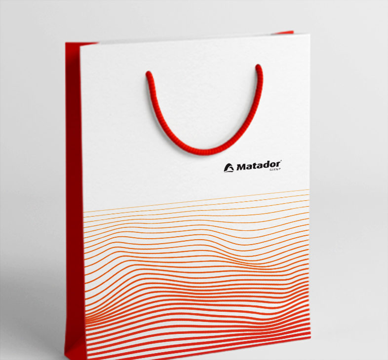
Notorious colour,
a brand new typography
During its 115 years of existence, the MATADOR Group brand has always been faithful to the three-combination of red, black and white colours, which highlighted its ferocity and dominance. The management did not feel the need for change even during its latest visual alteration. Therefore, we have only slightly supplemented the notorious palette. The energetic orange and neutral gray color do not diminish the Matador brand‘s strength, on the contrary, they increase its design variability and application possibilities. A much more significant change occurred in typography. The new one utilizes simple modern lines and works perfectly in a wide range of online and offline communication touchpoints.

Bold branding
based on dynamics
The key elements of the new visual identity of the brand are modern visualizations and deep red – orange waves. These represent vibrations that transfer energy or information from one place to another in a dynamic motion. Just as the MATADOR Group brand is passing from generation to generation, from technology to technology and expanding its operations from one industry to another, the wave is in constant motion. The wave element represents a visual metaphor that is applicable not only to large solid spaces but also in isolation. It thus represents one of the key elements of the brand, which increases its recognizability and memorability in the eyes of the target audience and the general public.

Attractive visual identity
and stylish merch
The MATADOR Group employs hundreds of people, operates in three European markets and develops activities in various areas of business from design and engineering, through serial production to industrial automation. The company’s activities are therefore extremely extensive and the scope of application of corporate identity had to correspond to them. For the client, we have designed the branding of a wide range of materials from standard correspondence in the form of envelopes, business cards and folders to the branding of mugs, T-shirts and other merchandise elements, representing the brand inside and outside the company.


Evolution in brand visuality
The proposed design language represents a significant evolution in the visuality of the brand and, together with the new communication claim Innovation to win, has the ambition to transform the MATADOR Group into the role of an innovative leader in its segment. A significant but well-thought-out change should prepare the brand for the digital age and give it the confidence for bolder and more progressive communication. The new corporate identity is summarized in a strategic document (logo manual and design manual), the task of which is to ensure consistent brand expression across all communication activities.


Design language for the digital age
In order to expand the possibilities and make communication in the online space more attractive, we also thought of modern, dynamic elements when creating visuals. Stylish wave animations and work with product visualizations have provided us with virtually unlimited possibilities of applications that the brand will use not only on social networks, but also in a wide range of other means of communication in the current digital age.
Modern and attractive sound logo
The MATADOR brand gives the green light to both innovations in communication and new sound logos from our production. The deep tone combined with the delicate electronic ending motivically follows the sound expression of the powerful engine and clearly refers to the history of the brand and the dominant position of the automotive industry in its business portfolio. The proposed sound will be gradually implemented into all multimedia formats in the brand’s communication and will thus become another element increasing its memorability and recognizability.


