A natural space for experimentation
With the rise of sustainable design, it's also important in the alternative materials market to appeal to potential customers with a memorable and unique brand that will remain distinctive even when faced with increasing competition. Barcelona-based Natural Fiberlab, which specialises in 3D printing using organic materials and plant fibers, had a similar request.
Natural Fiberlab, which is part of the Barcelona-based Bamboo Hub group, seeks to respond to increasing market demands and provide quality products from ecological materials, as well as scope for the production of alternatives to traditional plastics. With the aim to provide space for the research, testing and production of natural material models, it also promotes ecological design. Of course, we took all these factors into account in the project. And the client had one more, rather atypical, request. The new identity should also evoke the dynamism and elegance of the ingenious technological processing of natural materials, and the sophisticated production processes.
Beyond stereotypes
A kick-off workshop with the client established what qualities the future brand should express. The references to elegance and simplicity inspired us to create a visual language. But for the core brand identity to embrace the organic look, we needed to bypass the stereotypes related to natural materials, such as leaves, flowers and stems. We instead considered natural fibres such as bamboo, coconut and others.
Logo under the microscope
An analysis of the sector and client activities led us to explore the visual properties of natural textures, structures and especially plant fibres. By searching microscopic images of plants – such as bamboo, coconut, hemp and cactus – we defined the starting point for the future pictogram. Dynamism and elegance were then achieved by using the initial letter ‘N’ (as in Natural) to express cooperation and flexibility. We then used the outputs to create a neat logo and design manual for the brand.
Choosing pigment-based palette
An important part of the visual identity’s creation was a manifestation of the colours. These should be clearly distinguishable in a competitive field, despite positioning in the areas of research activity and sustainable design. So instead of the usual colour schemes, we sought options in the natural pigment of plants and skin: melanin. We finally rendered the identity as elegant and sophisticated by using the primary taupe colour tone.

Simply attractive options
The new visual identity system enabled further natural options of application which respected sustainable design principles. Thanks to the selection of suitable materials, even business cards on recycled matte paper (300 g) or laser milling on cartons or cardboard can be achieved without colour adjustments, and the visually-attractive symbol will be perfectly prominent.

Contemporary font
The visual design includes the modern, simple and elegant sans-serif Satoshi font with minimalist composition – even in thicker uses such as Bold, Black and Bold Italic. Functionally, the font is characterised by a typeface and properties that respect the linguistic specifics of other languages, including graphemes such as tildes, accents and inverted punctuation marks.


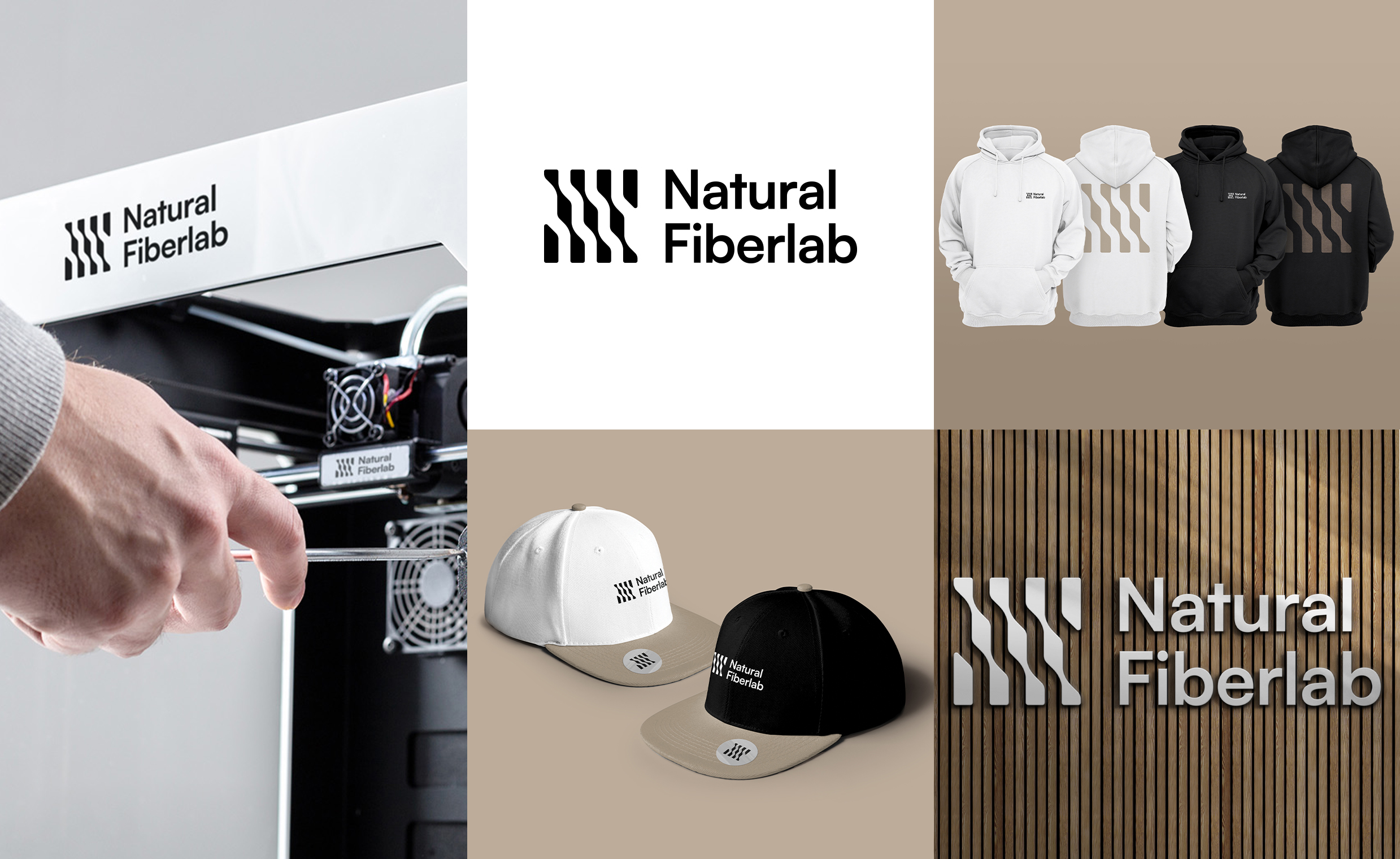
A use-adaptive brand
Our testing went beyond the theoretical and the client’s needs. The Natural Fiberlab brand manual’s design included the visualisation of branding on clothing or the company’s merch and in the context of production. Additionally, the logo was also applied to the least exposed parts of 3D printers, CNC cutters and lasers. The brand’s visual assets have found original use online and offline, both for marketing purposes (website, social networks, DTP and business cards) and on Natural Fiberlab products.


